


Programming
In advertising communication, symbols are used to direct the target audience. The term "symbol" comes from the Greek word "symbolon," which means "to unite." Symbols represent both the "existing" and the "non-existing." For example, the cross, while designating "Christians," also "separates" those who are not. In advertising messages, colors are frequently used for this purpose. To understand the meaning expressed by colors in advertisements, it’s important to know the color group in which the color belongs. Colors appeal to an individual’s inner world and stir emotions.
For example, when we are feeling down, we wear blue. Blue is the symbol of the sky, wide horizons, and the sea. It signifies boundlessness, represents tranquility, and has a calming effect.
In advertisements for drinking water, blue and white are commonly used. The message conveyed in the advertisement is "healthy," "natural," and "pure."
Similarly, green, which is known to belong to the "water" group, is also considered a "cold" color. However, it makes the individual feel they are "in nature," offering calmness, inner peace, and hope. In advertisements for plant-based teas, the color green conveys messages like "health," "renewal," "healing," "balance," "naturalness," and "comfort."
The symbol of light, vitality, life, and warmth is yellow. Yellow tones are frequently used in advertising communication. Yellow, as a color from the air group, represents the sun and provides energy.
White, from the air group, symbolizes purity and cleanliness. For this reason, white is used in places related to health. White, which is a combination of all colors, symbolizes innocence according to religious beliefs.
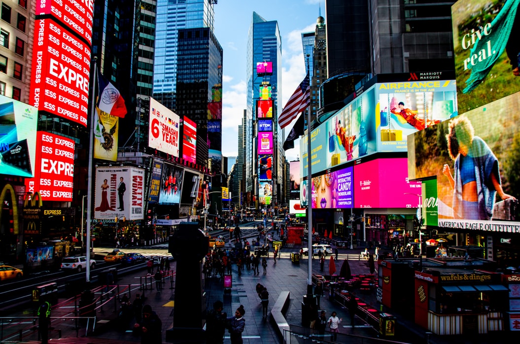
Red is a color associated with vitality and dynamism. Red represents physical liveliness. It stimulates the appetite. This is why most food companies around the world use red in their advertising messages.
Purple is considered the ultimate symbol of power, passed down from the past to the present. High-class individuals and palace representatives have always used purple.
Brown is the color of reality, plan, and system. Brown speeds up a person.
Dark blue symbolizes infinity, prestige, and productivity. That’s why more than half of the companies in the world use dark blue in their logos.
Tagged with :
advertising
marketing
